


Welcome to Brand Guidelines
From Teaching
To Learning

A guide to VMA's brand identity
Welcome to the brand guidelines for the Virtual Medical Academy.
Ensuring consistency and reinforcing our mission to empower medical professionals through a modern learning ecosystem.
VMA was launched on March 3rd, 2013
Since 2013


Virtual Medical Academy was the first health e-learning platform that was approved by the Saudi Commission for Health Specialties.
It aims to provide an innovative and modern educational environment with a holistic view that contributes to raising the efficiency of human life by providing qualified health educational programs in an Easy and available manner to all healthcare providers.
And now VMA is more than 14 years of experience.
Our brand is built on the principles of innovation, professionalism, and a learner-centric approach to medical education.
Our mission is to provide a modern, accessible, and effective learning ecosystem that empowers healthcare professionals and students on their journey of lifelong learning.
These guidelines are designed to ensure our brand is represented consistently and cohesively across all platforms and materials. Adhering to these standards will strengthen our brand identity and reinforce our position as a leader in medical e-learning.


Vision
Leading the regional shift from teaching to learning to empower healthcare practitioners and advance human health.
Mission
To deliver cutting-edge, interactive learning experiences that equip healthcare professionals and students with enduring competencies, driving excellence in healthcare delivery and improving quality of life.

Values
Trust, Integrity, Accessibility, Ease, Quality, Innovation, Excellence
Voice & Tone
Our identity links academia and digital innovation.
We empower users to move from passive reception to mastery.

Voice & Tone
The VMA voice is professional and confident, designed to be the **Enlightened Enabler**. The tone shifts depending on the audience, but must remain clear and supportive.
Audiences
VMA has 3 audiences:
- We’re experts for Medical Students.
- We’re advisors for Healthcare Providers.
- We’re professional partners to Healthcare Companies.
Voice
Our voice is the constant personality of the VMA. It remains the same regardless of who we are talking to.


We are:
The Enlightened Enabler:
We provide the tools and accreditation; the learner provides the drive.
Authoritative & Accredited:
As we accredited from the Saudi Commission for Health Specialties (SCFHS), we are committed to excellence.
Future-Focused:
We use active, forward-looking language that aligns with Vision 2030 (e.g., "Create," "Advance," "Transform").
Accessible:
We demystify complex medical topics without oversimplifying them.

We are not:
Passive or Static:
We avoid language that suggests rote memorization (e.g., we don't just "show" content; we "engage" users).
Elitist or Distant:
We are not an ivory tower; we are a community hub for 500,000+ practitioners.
Overly Commercial:
We do not sound like a salesperson; we sound like a partner in professional growth.
Informal or Slangy:
We never compromise professional medical dignity for the sake of being "trendy."
Tone
While our voice is constant, our tone adapts to the specific needs and emotional states of our three distinct audiences.
1. For Medical Students
Tone: Mentoring, Encouraging, Foundational, Clear.
- Context: Students are often anxious about exams (SMLE) and their future careers. They need a guide who believes in them.
- Key Approach: Use action verbs that inspire confidence. Focus on "starting right" and "building a future."
- Example:
- Don't say: "You can buy exam prep courses here to pass."
- Do say: "Start your journey on solid ground. Master the essentials and approach your SMLE with confidence. Your future begins today."
2. For Healthcare Providers
Tone: Professional, Peer-to-Peer, Respectful, Efficient.
- Context: These are busy professionals (Doctors, Nurses, Pharmacists) seeking CME hours or specialized skills. They value their time and professional status.
- Key Approach: Be direct and value-driven. Acknowledge their expertise while offering tools to enhance it. Use terminology that respects their seniority.
- Example:
- Don't say: "We teach you new things so you can be better at your job."
- Do say: "Elevate your clinical practice with accredited, evidence-based insights. Access decision-support tools designed to integrate seamlessly into your daily workflow."
3. For Healthcare Companies & Brands
Tone: Strategic, Data-Driven, Collaborative, Impactful.
- Context: B2B partners (Pharma, MedTech) looking for access to the VMA network for marketing or sponsorship. They care about ROI, reach, and compliance.
- Key Approach: Focus on "Partnership" and "Ecosystem." Use business-centric language (Reach, Engagement, Outcomes).
- Example:
- Don't say: "Advertise your products on our website to get more sales."
- Do say: "Secure meaningful engagement by connecting with the heart of the Saudi healthcare sector. Partner with us to drive brand resonance through accredited scientific content."
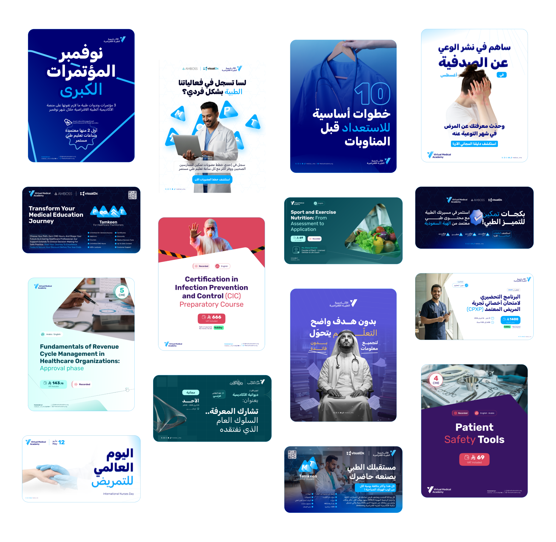
Sample Copy
Transform Your Medical Events Into Meaningful Experiences
We turn scientific content into immersive journeys that inspire learning, engagement, and real clinical impact, not just attendance.
Because Access without trust is noise
Backed by 500,000+ verified healthcare professionals, we deliver campaigns that builds influence, trust, not just reach that generates noise.
The preparatory course for the pediatric section of the SMLE exam is about to start.
Learn about the key topics you need to review, participate in simulated MCQ question analysis, and get practical tips from a pediatric consultant.
Requirements to apply for the BCPS certification exam for pharmacists.
1- Hold an accredited pharmacy degree - 2- Have 3 years of practical experience - 3- Possess a valid professional license.
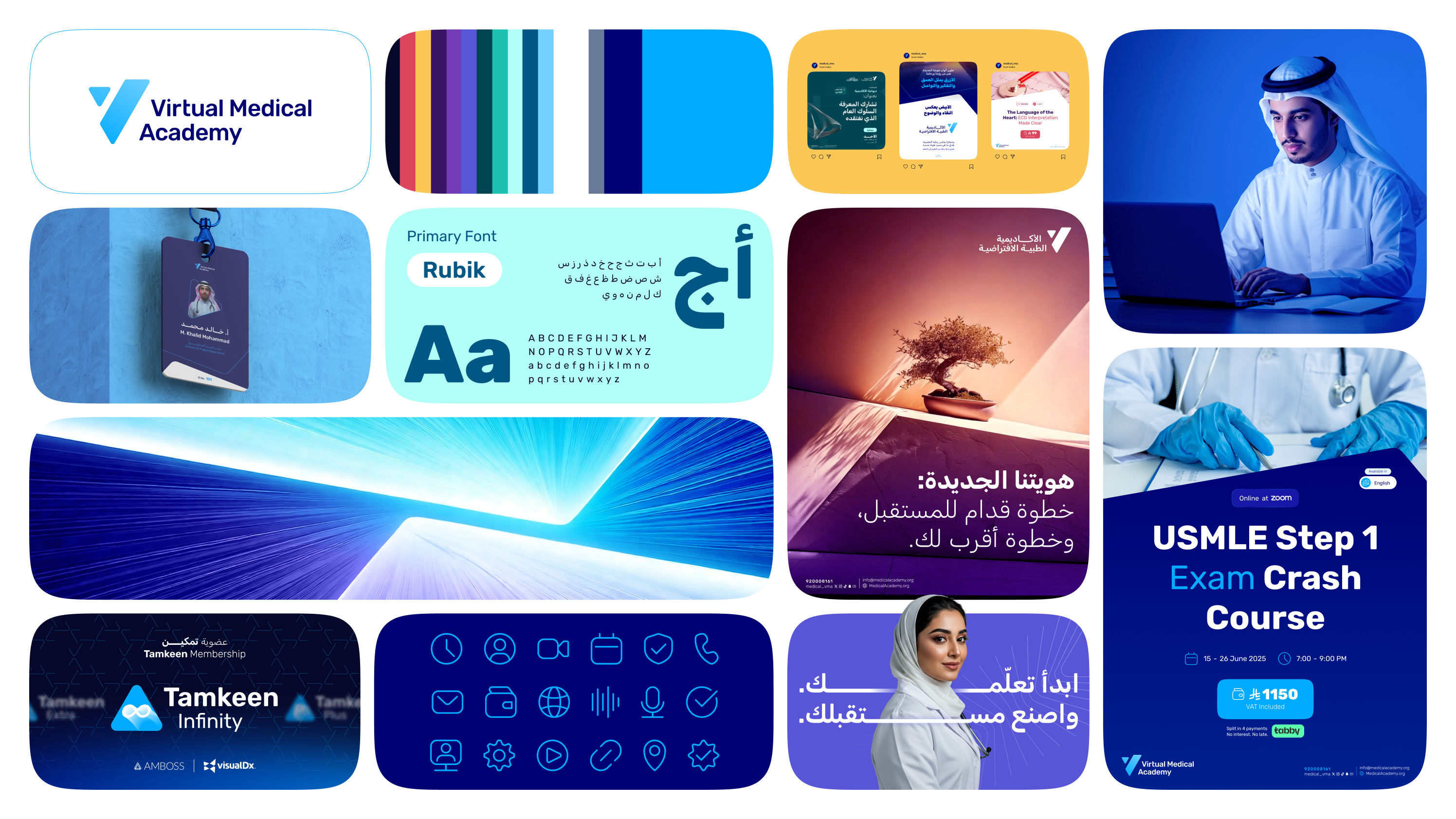
Logo
A mark of learning and vision.
Trusted mark that guides practitioners towards excellence.

Logo Semiotics & Meaning


Our visual identity is constructed from three core pillars that define our promise to healthcare professionals and students
Medical Pulse
Vitality
Media Play
Access to Knowledge
Triangle
Strength & Stability
Logo
The VMA logo is the primary identifier of our brand. It is a combination of a unique mark and a clean wordmark, representing our forward-thinking approach and the clarity of our educational mission.

Download
Direct download:
English Version
PNG
SVG
Arabic Version
PNG
SVG
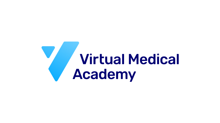
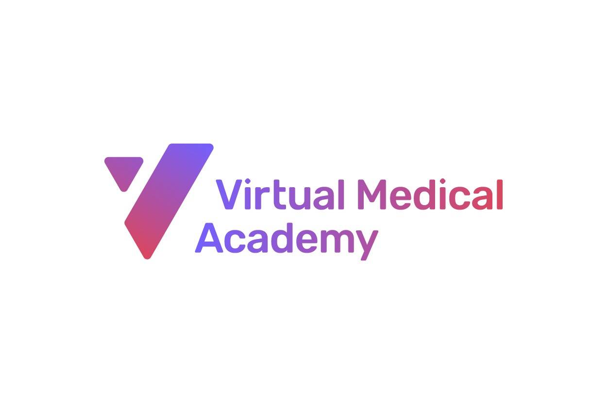
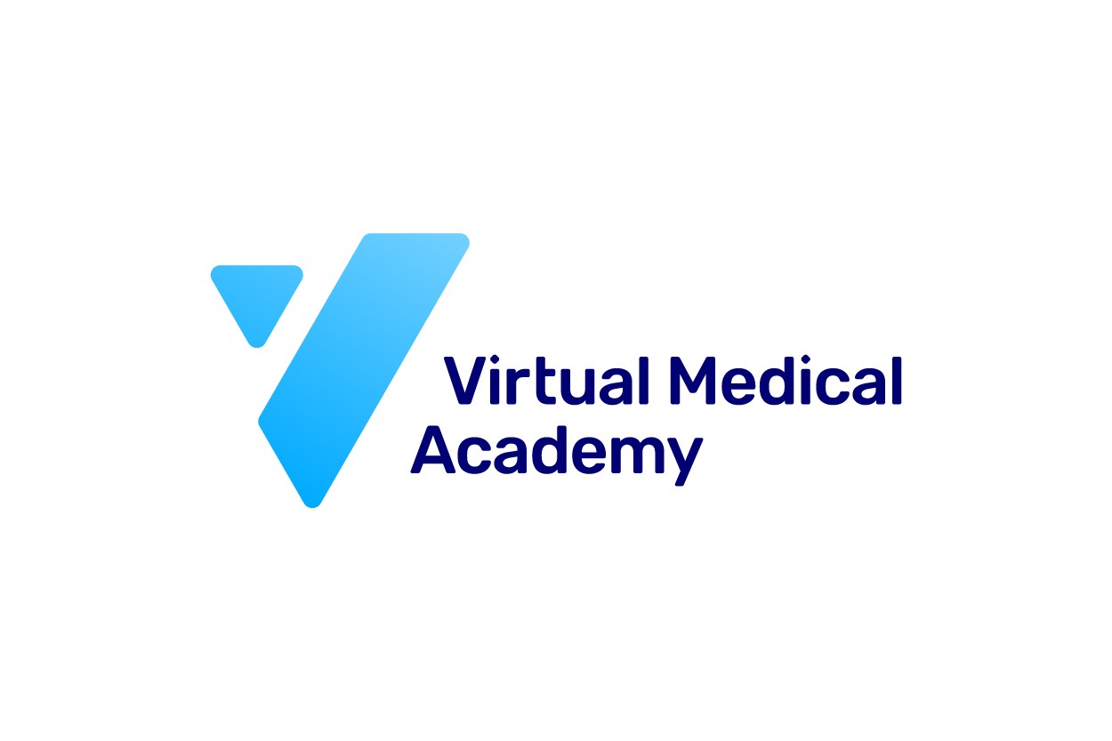
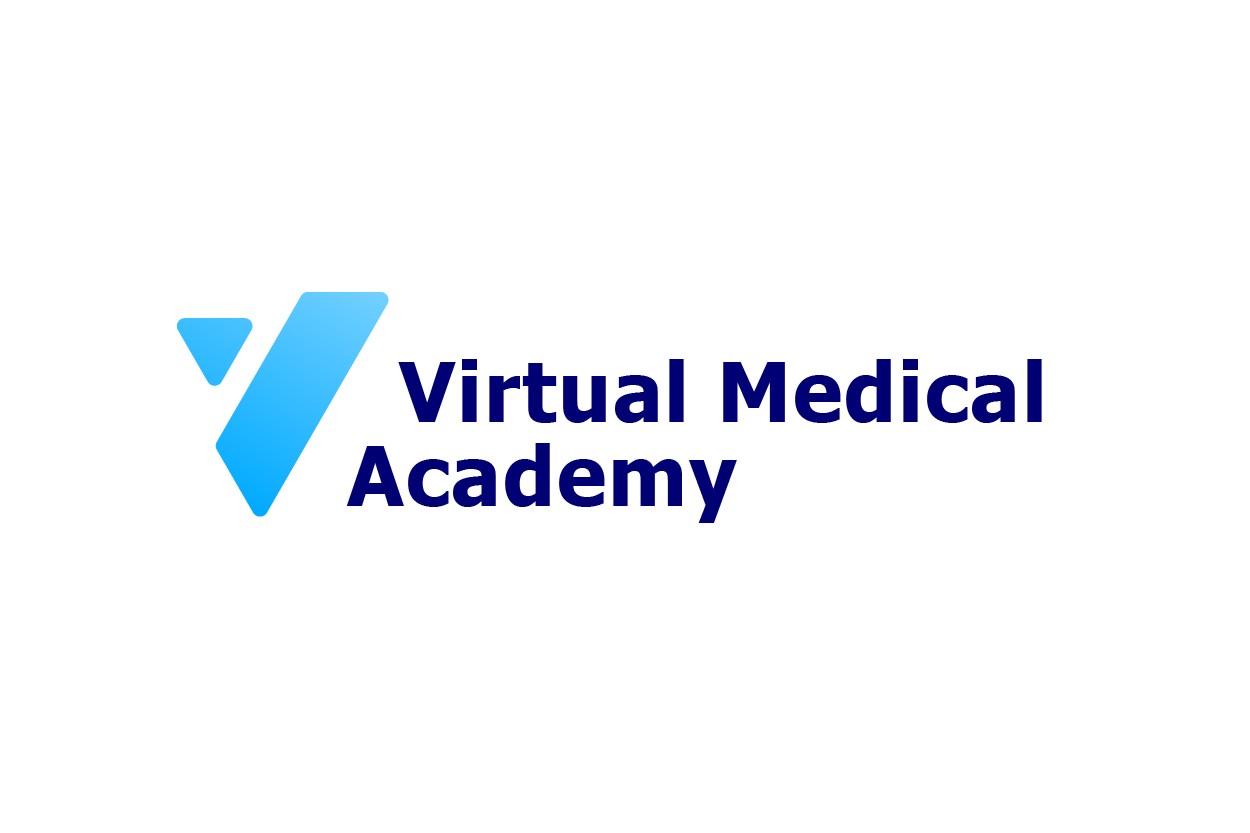
The primary logo consists of the gradient "V" mark and the two-line "Virtual Medical Academy" wordmark. This is the preferred version and should be used whenever possible.
Built on Precision
Our brand mark is constructed using a precise geometric system with two angular shapes—a "V" form and a parallelogram—built at exact 75° and 120° angles. Every element follows consistent spacing on an underlying grid, ensuring our logo looks perfect whether you see it on your phone, a business card, or a billboard.
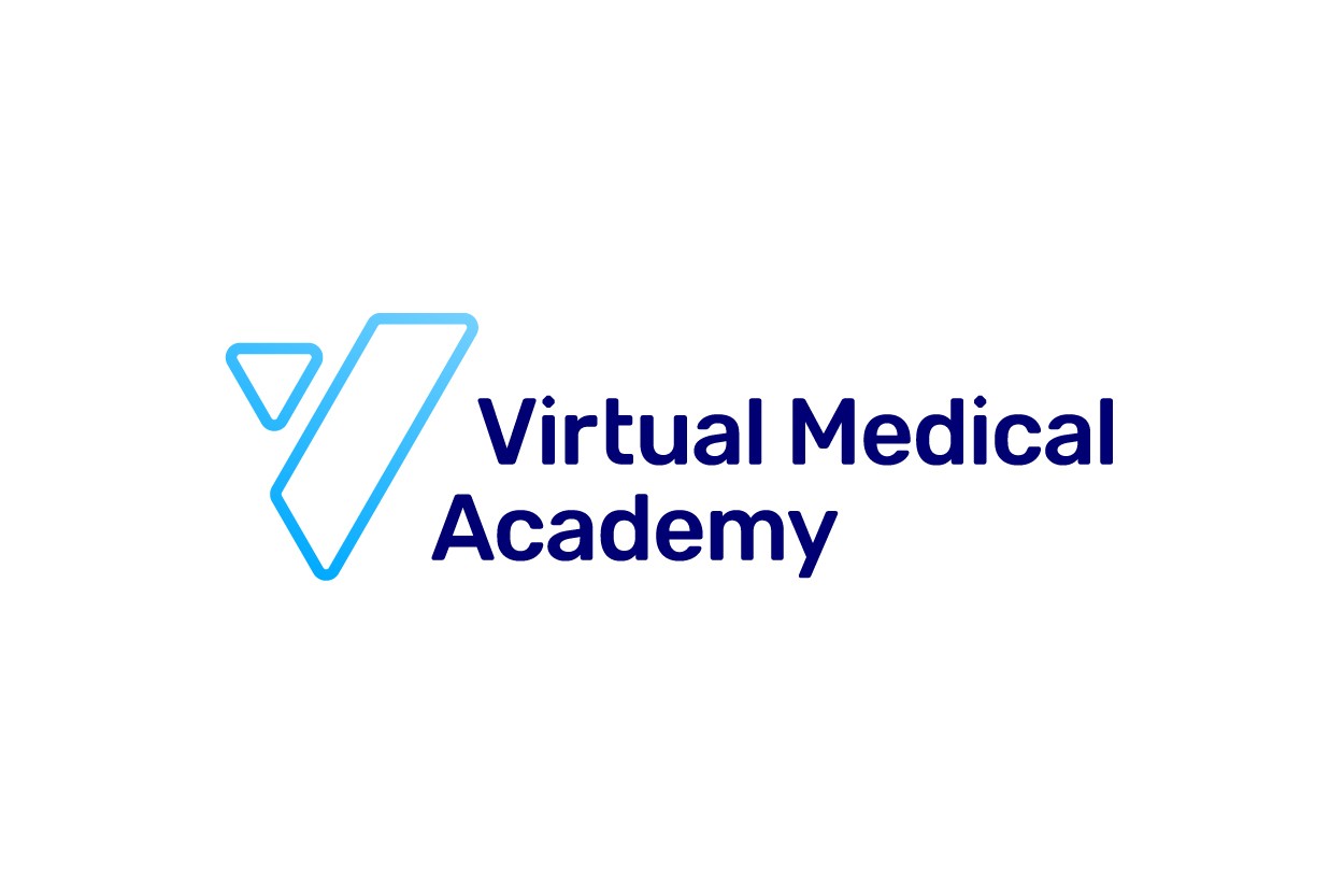
Mono Logo
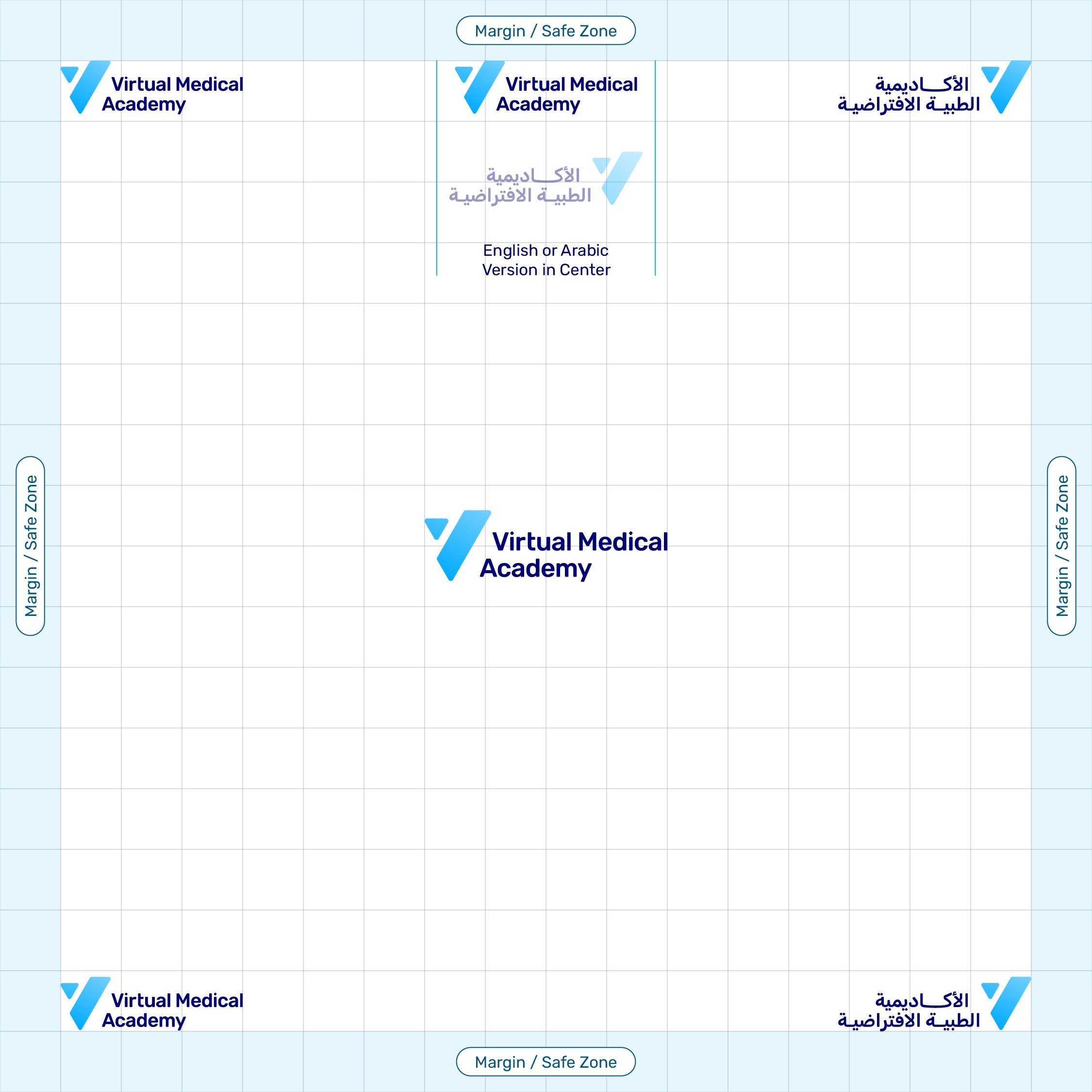
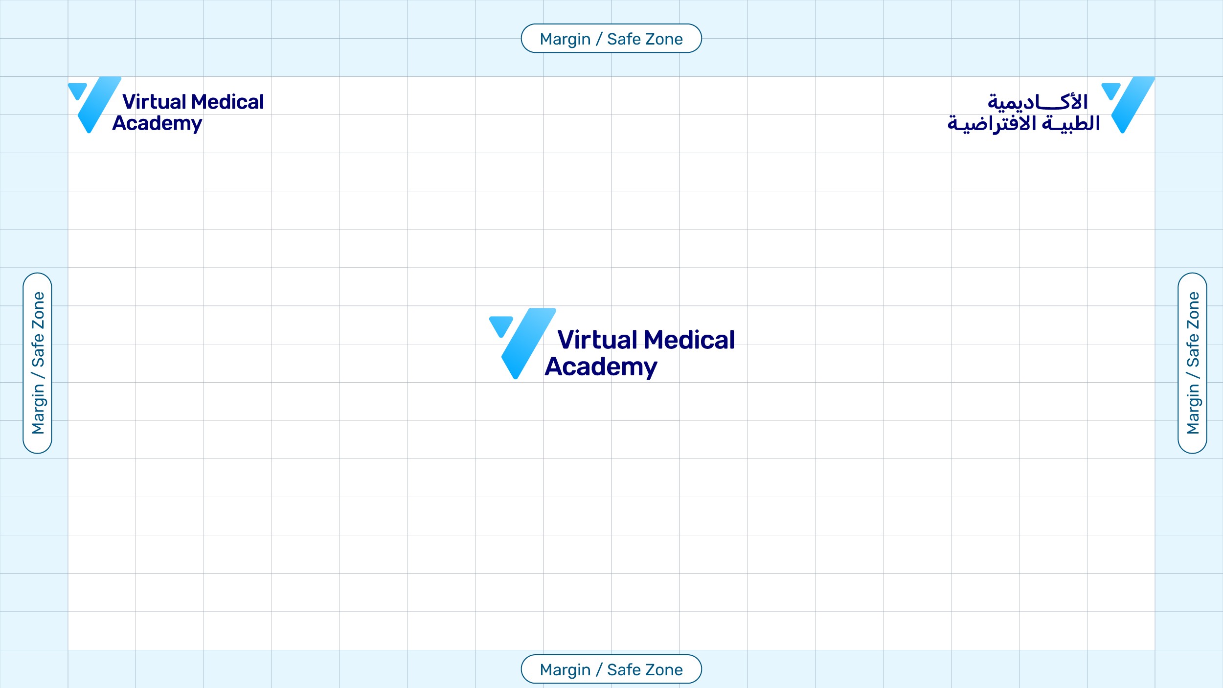
Logo clear space
It uses the height of the mark's triangle (labeled 'x') to establish a proportional protective margin around the entire design to ensure legibility. Please follow the recommended minimum clear space.
Sizing requirements
The minimum size requirements for the VMA logo to ensure legibility. It dictates that the logo height must never be smaller than 25 pixels for digital screens or 0.25 inches for print applications, preventing the fine typography from becoming unreadable. please do not use in smaller than these recommended minimum sizes.
Vertical Position

VMA Mark
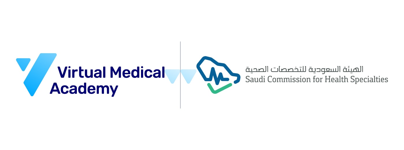
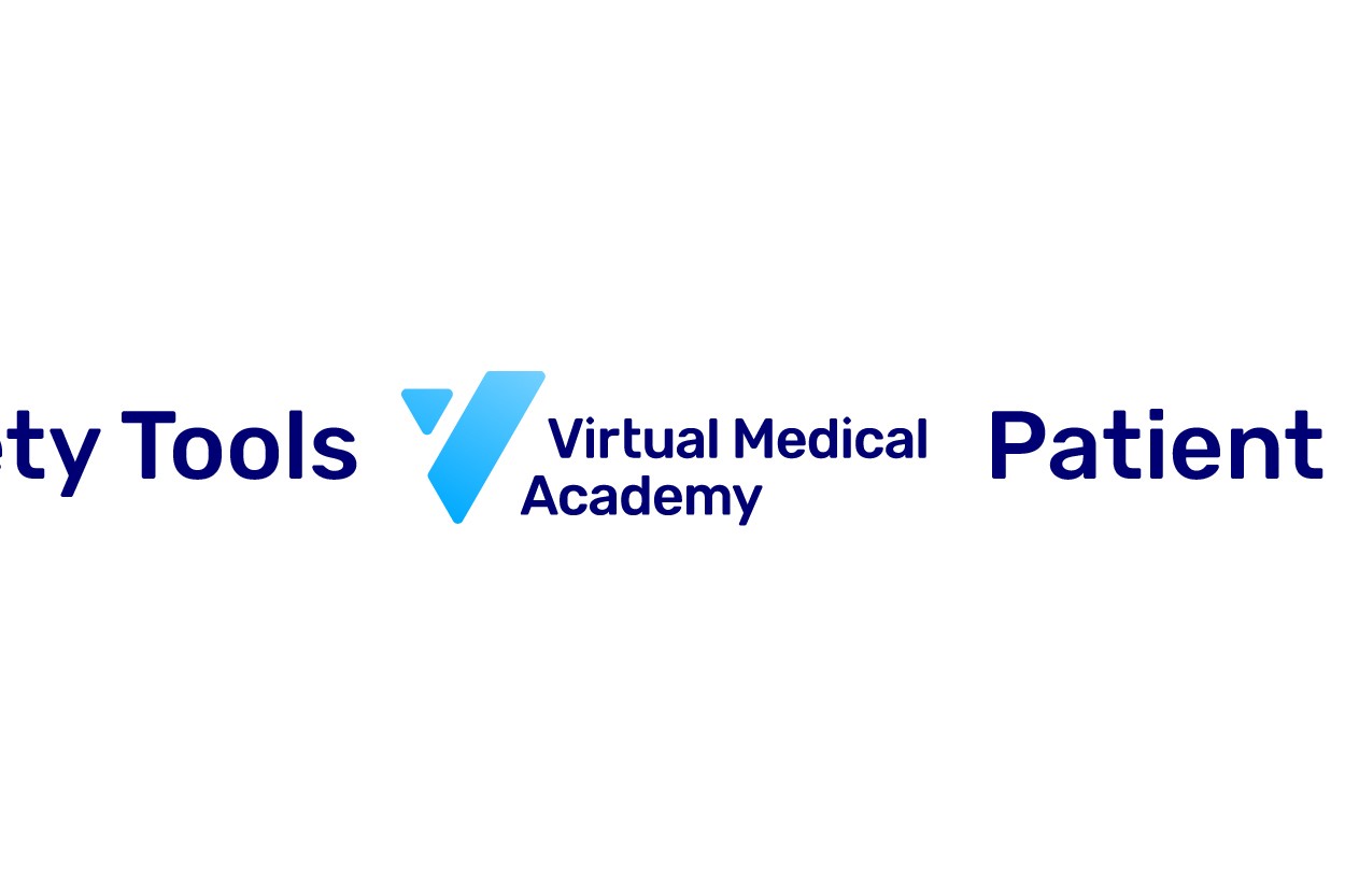
Co-Branding
A clear space should be left between the two brands, separated by a triangular cross “▼” of the logo mark (and could be twice the triangular cross x2), to ensure their visibility and distinction. A small line is used to delineate the partnership boundaries.
Usage
To maintain the integrity of the VMA brand, it is essential that the logo is used consistently across all communications. The following rules ensure that our visual identity remains professional, recognizable, and authoritative.
Dos
Using the default logo.
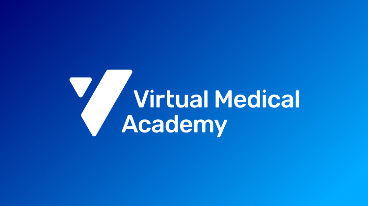
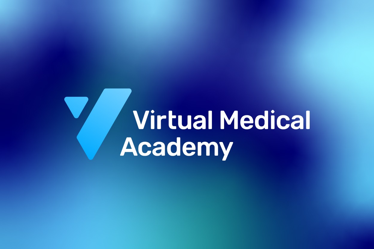
Use the white version if there is a gradient or a color other than the primary blue.

Use a monochrome color on images with excellent contrast.

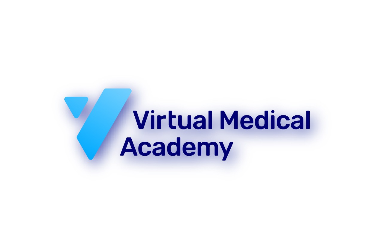
Use the logo on images with clear or muted contrast.

Use a blurred background behind the logo for clarity from images.
Don’ts
Do not distort the logo.
Do not add effects or gradient.
Do not change the size of the brand mark.
Do not outline the mark.

Do not rotate.
Do not use the logo within the sentence.
Do not use other typefaces.
Do not use shadow.
Do not use two colors with a busy contrast.

Do not place the logo on photos with poor contract.
Placement
The English version is typically placed on the left, while the Arabic version is on the right, respecting regional reading directions on all sizes. Additionally, either the English or Arabic logo can be used in a prominent, centralized position to ensure maximum visibility within the designated margin and safe zones.
*In Horizontal Size & Videos the logo on top side (And/or depend of the the partnership)
Colors
Palette scientifically calibrates trust, clarity, and digital energy
Establishing VMA as the future of medical education.

Colors
Our color palette is modern, professional, and versatile. It is designed to create a sense of trust, intelligence, and innovation. The primary colors should dominate our designs, with secondary and accent colors used strategically to highlight key information and calls-to-action.

Download Palette
Color combinations
Here is a collection of suggested color pairings. These colors work well on-top of each other and provide enough contrast for the reader.


Typography
Our curated fonts articulate knowledge with balanced clarity
Transforming medical contents into engaging experiences.

Typography
It must prioritize legibility (essential for medical content) while conveying a modern, accessible feel.
Download Fonts
Or download from
Direct Drive
Host Once, Reach Learners for a Year
Provide 1-year flexible access to your medical courses with our hosting platform.
Imagery
Our imagery highlights dynamic practitioners in learning.
Reflecting the brand's core philosophy of true empowerment.

Photography
Photography moves away from traditional, passive education towards active engagement, embodying the "From Teaching, To Learning" philosophy.
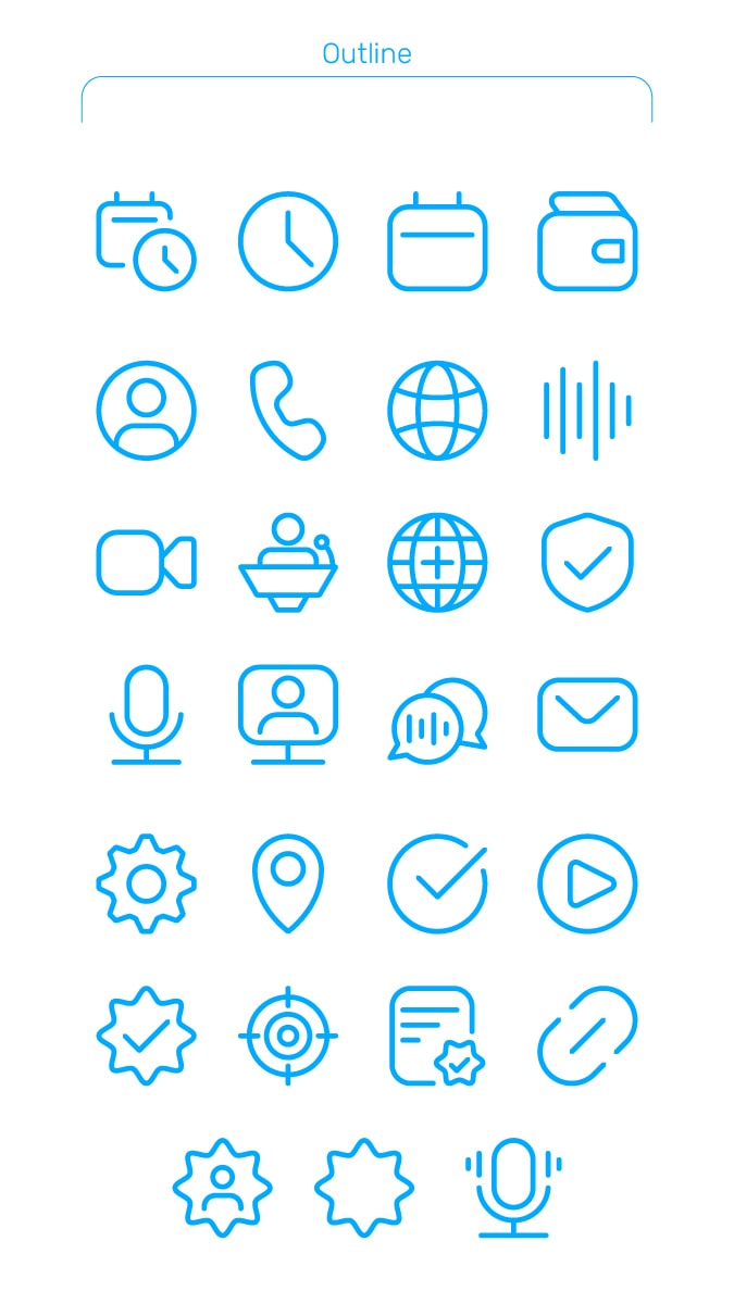
Iconography
Icons serve as navigational aids and visual summaries
Maintaining a cohesive design language

Iconography
Main Icons (Primary): These should employ a clean, simple monoline (outline) style , colored in VMA Blue or a complementary color to ensure legibility and functional focus.

Download Icons
Design Principle: Icons must be consistent in visual weight and style across the entire platform to prevent visual distraction and cognitive load.
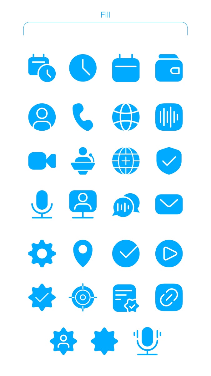
Illustrative Icons (Secondary): Used in feature lists or content cards to represent specific course categories or concepts (e.g., a graduation cap for accreditation).

These may utilize filled or duotone styles to add visual depth.


Welcome to Brand Guidelines
From Teaching
To Learning
A guide to VMA's brand identity
Welcome to the brand guidelines for the Virtual Medical Academy.
Ensuring consistency and reinforcing our mission to empower medical professionals through a modern learning ecosystem.
VMA was launched on March 3rd, 2013
Since 2013
Virtual Medical Academy was the first health e-learning platform that was approved by the Saudi Commission for Health Specialties.
It aims to provide an innovative and modern educational environment with a holistic view that contributes to raising the efficiency of human life by providing qualified health educational programs in an Easy and available manner to all healthcare providers.
And now VMA is more than 14 years of experience.
Our brand is built on the principles of innovation, professionalism, and a learner-centric approach to medical education.
Our mission is to provide a modern, accessible, and effective learning ecosystem that empowers healthcare professionals and students on their journey of lifelong learning.
These guidelines are designed to ensure our brand is represented consistently and cohesively across all platforms and materials. Adhering to these standards will strengthen our brand identity and reinforce our position as a leader in medical e-learning.
Vision
Leading the regional shift from teaching to learning to empower healthcare practitioners and advance human health.
Mission
To deliver cutting-edge, interactive learning experiences that equip healthcare professionals and students with enduring competencies, driving excellence in healthcare delivery and improving quality of life.
Values
Trust, Integrity, Accessibility, Ease, Quality, Innovation, Excellence
Voice & Tone
Our identity links academia and digital innovation.
We empower users to move from passive reception to mastery.
Voice & Tone
The VMA voice is professional and confident, designed to be the **Enlightened Enabler**. The tone shifts depending on the audience, but must remain clear and supportive.
Audiences
VMA has 3 audiences:
- We’re experts for Medical Students.
- We’re advisors for Healthcare Providers.
- We’re professional partners to Healthcare Companies.
Voice
Our voice is the constant personality of the VMA. It remains the same regardless of who we are talking to.
We are:
The Enlightened Enabler:
We provide the tools and accreditation; the learner provides the drive.
Authoritative & Accredited:
As we accredited from the Saudi Commission for Health Specialties (SCFHS), we are committed to excellence.
Future-Focused:
We use active, forward-looking language that aligns with Vision 2030 (e.g., "Create," "Advance," "Transform").
Accessible:
We demystify complex medical topics without oversimplifying them.
We are not:
Passive or Static:
We avoid language that suggests rote memorization (e.g., we don't just "show" content; we "engage" users).
Elitist or Distant:
We are not an ivory tower; we are a community hub for 500,000+ practitioners.
Overly Commercial:
We do not sound like a salesperson; we sound like a partner in professional growth.
Informal or Slangy:
We never compromise professional medical dignity for the sake of being "trendy."
Tone
While our voice is constant, our tone adapts to the specific needs and emotional states of our three distinct audiences.
1. For Medical Students
Tone: Mentoring, Encouraging, Foundational, Clear.
- Context: Students are often anxious about exams (SMLE) and their future careers. They need a guide who believes in them.
- Key Approach: Use action verbs that inspire confidence. Focus on "starting right" and "building a future."
- Example:
- Don't say: "You can buy exam prep courses here to pass."
- Do say: "Start your journey on solid ground. Master the essentials and approach your SMLE with confidence. Your future begins today."
2. For Healthcare Providers
Tone: Professional, Peer-to-Peer, Respectful, Efficient.
- Context: These are busy professionals (Doctors, Nurses, Pharmacists) seeking CME hours or specialized skills. They value their time and professional status.
- Key Approach: Be direct and value-driven. Acknowledge their expertise while offering tools to enhance it. Use terminology that respects their seniority.
- Example:
- Don't say: "We teach you new things so you can be better at your job."
- Do say: "Elevate your clinical practice with accredited, evidence-based insights. Access decision-support tools designed to integrate seamlessly into your daily workflow."
3. For Healthcare Companies & Brands
Tone: Strategic, Data-Driven, Collaborative, Impactful.
- Context: B2B partners (Pharma, MedTech) looking for access to the VMA network for marketing or sponsorship. They care about ROI, reach, and compliance.
- Key Approach: Focus on "Partnership" and "Ecosystem." Use business-centric language (Reach, Engagement, Outcomes).
- Example:
- Don't say: "Advertise your products on our website to get more sales."
- Do say: "Secure meaningful engagement by connecting with the heart of the Saudi healthcare sector. Partner with us to drive brand resonance through accredited scientific content."
Sample Copy
Transform Your Medical Events Into Meaningful Experiences
We turn scientific content into immersive journeys that inspire learning, engagement, and real clinical impact, not just attendance.
Because Access without trust is noise
Backed by 500,000+ verified healthcare professionals, we deliver campaigns that builds influence, trust, not just reach that generates noise.
The preparatory course for the pediatric section of the SMLE exam is about to start.
Learn about the key topics you need to review, participate in simulated MCQ question analysis, and get practical tips from a pediatric consultant.
Requirements to apply for the BCPS certification exam for pharmacists.
1- Hold an accredited pharmacy degree - 2- Have 3 years of practical experience - 3- Possess a valid professional license.
Logo
A mark of learning and vision.
Trusted mark that guides practitioners towards excellence.
Logo Semiotics & Meaning


Our visual identity is constructed from three core pillars that define our promise to healthcare professionals and students
Medical Pulse
Vitality
Media Play
Access to Knowledge
Triangle
Strength & Stability
Logo
The VMA logo is the primary identifier of our brand. It is a combination of a unique mark and a clean wordmark, representing our forward-thinking approach and the clarity of our educational mission.

Download
Direct download:
English Version
PNG
SVG
Arabic Version
PNG
SVG
The primary logo consists of the gradient "V" mark and the two-line "Virtual Medical Academy" wordmark. This is the preferred version and should be used whenever possible.
Built on Precision
Our brand mark is constructed using a precise geometric system with two angular shapes—a "V" form and a parallelogram—built at exact 75° and 120° angles. Every element follows consistent spacing on an underlying grid, ensuring our logo looks perfect whether you see it on your phone, a business card, or a billboard.
Mono Logo
Logo clear space
It uses the height of the mark's triangle (labeled 'x') to establish a proportional protective margin around the entire design to ensure legibility. Please follow the recommended minimum clear space.
Sizing requirements
The minimum size requirements for the VMA logo to ensure legibility. It dictates that the logo height must never be smaller than 25 pixels for digital screens or 0.25 inches for print applications, preventing the fine typography from becoming unreadable. please do not use in smaller than these recommended minimum sizes.
Vertical Position
VMA Mark
Co-Branding
A clear space should be left between the two brands, separated by a triangular cross “▼” of the logo mark (and could be twice the triangular cross x2), to ensure their visibility and distinction. A small line is used to delineate the partnership boundaries.
Usage
To maintain the integrity of the VMA brand, it is essential that the logo is used consistently across all communications. The following rules ensure that our visual identity remains professional, recognizable, and authoritative.
Dos
Using the default logo.
Use the white version if there is a gradient or a color other than the primary blue.
Use a monochrome color on images with excellent contrast.
Use the logo on images with clear or muted contrast.
Use a blurred background behind the logo for clarity from images.
Don’ts
Do not distort the logo.
Do not add effects or gradient.
Do not change the size of the brand mark.
Do not outline the mark.
Do not rotate.
Do not use the logo within the sentence.
Do not use other typefaces.
Do not use shadow.
Do not use two colors with a busy contrast.
Do not place the logo on photos with poor contract.
Placement
The English version is typically placed on the left, while the Arabic version is on the right, respecting regional reading directions on all sizes. Additionally, either the English or Arabic logo can be used in a prominent, centralized position to ensure maximum visibility within the designated margin and safe zones.
*In Horizontal Size & Videos the logo on top side (And/or depend of the the partnership)
Colors
Palette scientifically calibrates trust, clarity, and digital energy
Establishing VMA as the future of medical education.
Colors
Our color palette is modern, professional, and versatile. It is designed to create a sense of trust, intelligence, and innovation. The primary colors should dominate our designs, with secondary and accent colors used strategically to highlight key information and calls-to-action.

Download Palette
Color combinations
Here is a collection of suggested color pairings. These colors work well on-top of each other and provide enough contrast for the reader.
Typography
Our curated fonts articulate knowledge with balanced clarity
Transforming medical contents into engaging experiences.
Typography
It must prioritize legibility (essential for medical content) while conveying a modern, accessible feel.
Download Fonts
Or download from
Direct Drive
Host Once, Reach Learners for a Year
Provide 1-year flexible access to your medical courses with our hosting platform.
Imagery
Our imagery highlights dynamic practitioners in learning.
Reflecting the brand's core philosophy of true empowerment.
Photography
Photography moves away from traditional, passive education towards active engagement, embodying the "From Teaching, To Learning" philosophy.
Iconography
Icons serve as navigational aids and visual summaries
Maintaining a cohesive design language
Iconography
Main Icons (Primary): These should employ a clean, simple monoline (outline) style , colored in VMA Blue or a complementary color to ensure legibility and functional focus.

Download Icons
Design Principle: Icons must be consistent in visual weight and style across the entire platform to prevent visual distraction and cognitive load.
Illustrative Icons (Secondary): Used in feature lists or content cards to represent specific course categories or concepts (e.g., a graduation cap for accreditation).
These may utilize filled or duotone styles to add visual depth.
About
Voice & Tone
Logo
Colors
Typography
Imagery
Iconography


All Rights Reserved, 2026©


Download
Back to VMA Website
Last Update: 1 / January (1) / 26
Ver.3.2
-
(Public)
Welcome to Brand Guidelines
From Teaching
To Learning
A guide to VMA's brand identity
Welcome to the brand guidelines for the Virtual Medical Academy.
Ensuring consistency and reinforcing our mission to empower medical professionals through a modern learning ecosystem.
VMA was launched on March 3rd, 2013
Since 2013
Virtual Medical Academy was the first health e-learning platform that was approved by the Saudi Commission for Health Specialties.
It aims to provide an innovative and modern educational environment with a holistic view that contributes to raising the efficiency of human life by providing qualified health educational programs in an Easy and available manner to all healthcare providers.
And now VMA is more than 14 years of experience.
Our brand is built on the principles of innovation, professionalism, and a learner-centric approach to medical education.
Our mission is to provide a modern, accessible, and effective learning ecosystem that empowers healthcare professionals and students on their journey of lifelong learning.
These guidelines are designed to ensure our brand is represented consistently and cohesively across all platforms and materials. Adhering to these standards will strengthen our brand identity and reinforce our position as a leader in medical e-learning.
Vision
Leading the regional shift from teaching to learning to empower healthcare practitioners and advance human health.
Mission
To deliver cutting-edge, interactive learning experiences that equip healthcare professionals and students with enduring competencies, driving excellence in healthcare delivery and improving quality of life.
Values
Trust, Integrity, Accessibility, Ease, Quality, Innovation, Excellence
Voice & Tone
Our identity links academia and digital innovation.
We empower users to move from passive reception to mastery.
Voice & Tone
The VMA voice is professional and confident, designed to be the **Enlightened Enabler**. The tone shifts depending on the audience, but must remain clear and supportive.
Audiences
VMA has 3 audiences:
- We’re experts for Medical Students.
- We’re advisors for Healthcare Providers.
- We’re professional partners to Healthcare Companies.
Voice
Our voice is the constant personality of the VMA. It remains the same regardless of who we are talking to.
We are:
The Enlightened Enabler:
We provide the tools and accreditation; the learner provides the drive.
Authoritative & Accredited:
As we accredited from the Saudi Commission for Health Specialties (SCFHS), we are committed to excellence.
Future-Focused:
We use active, forward-looking language that aligns with Vision 2030 (e.g., "Create," "Advance," "Transform").
Accessible:
We demystify complex medical topics without oversimplifying them.
We are not:
Passive or Static:
We avoid language that suggests rote memorization (e.g., we don't just "show" content; we "engage" users).
Elitist or Distant:
We are not an ivory tower; we are a community hub for 500,000+ practitioners.
Overly Commercial:
We do not sound like a salesperson; we sound like a partner in professional growth.
Informal or Slangy:
We never compromise professional medical dignity for the sake of being "trendy."
Tone
While our voice is constant, our tone adapts to the specific needs and emotional states of our three distinct audiences.
1. For Medical Students
Tone: Mentoring, Encouraging, Foundational, Clear.
- Context: Students are often anxious about exams (SMLE) and their future careers. They need a guide who believes in them.
- Key Approach: Use action verbs that inspire confidence. Focus on "starting right" and "building a future."
- Example:
- Don't say: "You can buy exam prep courses here to pass."
- Do say: "Start your journey on solid ground. Master the essentials and approach your SMLE with confidence. Your future begins today."
2. For Healthcare Providers
Tone: Professional, Peer-to-Peer, Respectful, Efficient.
- Context: These are busy professionals (Doctors, Nurses, Pharmacists) seeking CME hours or specialized skills. They value their time and professional status.
- Key Approach: Be direct and value-driven. Acknowledge their expertise while offering tools to enhance it. Use terminology that respects their seniority.
- Example:
- Don't say: "We teach you new things so you can be better at your job."
- Do say: "Elevate your clinical practice with accredited, evidence-based insights. Access decision-support tools designed to integrate seamlessly into your daily workflow."
3. For Healthcare Companies & Brands
Tone: Strategic, Data-Driven, Collaborative, Impactful.
- Context: B2B partners (Pharma, MedTech) looking for access to the VMA network for marketing or sponsorship. They care about ROI, reach, and compliance.
- Key Approach: Focus on "Partnership" and "Ecosystem." Use business-centric language (Reach, Engagement, Outcomes).
- Example:
- Don't say: "Advertise your products on our website to get more sales."
- Do say: "Secure meaningful engagement by connecting with the heart of the Saudi healthcare sector. Partner with us to drive brand resonance through accredited scientific content."
Sample Copy
Transform Your Medical Events Into Meaningful Experiences
We turn scientific content into immersive journeys that inspire learning, engagement, and real clinical impact, not just attendance.
Because Access without trust is noise
Backed by 500,000+ verified healthcare professionals, we deliver campaigns that builds influence, trust, not just reach that generates noise.
The preparatory course for the pediatric section of the SMLE exam is about to start.
Learn about the key topics you need to review, participate in simulated MCQ question analysis, and get practical tips from a pediatric consultant.
Requirements to apply for the BCPS certification exam for pharmacists.
1- Hold an accredited pharmacy degree, 2- Have 3 years of practical experience, 3- Possess a valid professional license.
Logo
A mark of learning and vision guiding practitioners toward excellence.
Trusted mark that guides practitioners towards excellence.
Logo Semiotics & Meaning
Our visual identity is constructed from three core pillars that define our promise to healthcare professionals and students
Medical Pulse
Vitality
Media Play
Access to Knowledge
Triangle
Strength & Stability
Logo
The VMA logo is the primary identifier of our brand. It is a combination of a unique mark and a clean wordmark, representing our forward-thinking approach and the clarity of our educational mission.
Download
Direct download:
English Version
PNG
SVG
Arabic Version
PNG
SVG
The primary logo consists of the gradient "V" mark and the two-line "Virtual Medical Academy" wordmark. This is the preferred version and should be used whenever possible.
Built on Precision
Our brand mark is constructed using a precise geometric system with two angular shapes—a "V" form and a parallelogram—built at exact 75° and 120° angles. Every element follows consistent spacing on an underlying grid, ensuring our logo looks perfect whether you see it on your phone, a business card, or a billboard.
Mono Logo
Logo clear space
It uses the height of the mark's triangle (labeled 'x') to establish a proportional protective margin around the entire design to ensure legibility. Please follow the recommended minimum clear space.
Sizing requirements
The minimum size requirements for the VMA logo to ensure legibility. It dictates that the logo height must never be smaller than 25 pixels for digital screens or 0.25 inches for print applications, preventing the fine typography from becoming unreadable. please do not use in smaller than these recommended minimum sizes.
Vertical Position
VMA Mark
Co-Branding
A clear space should be left between the two brands, separated by a triangular cross “▼” of the logo mark (and could be twice the triangular cross x2), to ensure their visibility and distinction. A small line is used to delineate the partnership boundaries.
Usage
To maintain the integrity of the VMA brand, it is essential that the logo is used consistently across all communications. The following rules ensure that our visual identity remains professional, recognizable, and authoritative.
Dos
Using the default logo.
Use the white version if there is a gradient or a color other than the primary blue.
Use a monochrome color on images with excellent contrast.
Use the logo on images with clear or muted contrast.
Use a blurred background behind the logo for clarity from images.
Don’ts
Do not distort the logo.
Do not add effects or gradient.
Do not change the size of the brand mark.
Do not outline the mark.
Do not rotate.
Do not use the logo within the sentence.
Do not use other typefaces.
Do not use shadow.
Do not use two colors with a busy contrast.
Do not place the logo on photos with poor contract.
Placement
The English version is typically placed on the left, while the Arabic version is on the right, respecting regional reading directions on all sizes. Additionally, either the English or Arabic logo can be used in a prominent, centralized position to ensure maximum visibility within the designated margin and safe zones.
*In Horizontal Size & Videos the logo on top side (And/or depend of the partnership)
Colors
Palette scientifically calibrates trust, clarity, and digital energy
Establishing VMA as the future of medical education.
Colors
Our color palette is modern, professional, and versatile. It is designed to create a sense of trust, intelligence, and innovation. The primary colors should dominate our designs, with secondary and accent colors used strategically to highlight key information and calls-to-action.
Download Palette
Color combinations
Here is a collection of suggested color pairings. These colors work well on-top of each other and provide enough contrast for the reader.
Typography
Our curated fonts articulate knowledge with balanced clarity
Transforming medical contents into engaging experiences.
Typography
It must prioritize legibility (essential for medical content) while conveying a modern, accessible feel.
Download Fonts
Or download from
Direct Drive
Host Once, Reach Learners for a Year
Provide 1-year flexible access to your medical courses with our hosting platform.
Imagery
Our imagery highlights dynamic practitioners in learning.
Reflecting the brand's core philosophy of true empowerment.
Photography
Photography moves away from traditional, passive education towards active engagement, embodying the "From Teaching, To Learning" philosophy.
Iconography
Icons serve as navigational aids and visual summaries
Maintaining a cohesive design language
Iconography
Main Icons (Primary): These should employ a clean, simple monoline (outline) style , colored in VMA Blue or a complementary color to ensure legibility and functional focus.
Download Icons
Design Principle: Icons must be consistent in visual weight and style across the entire platform to prevent visual distraction and cognitive load.
Illustrative Icons (Secondary): Used in feature lists or content cards to represent specific course categories or concepts (e.g., a graduation cap for accreditation).
These may utilize filled or duotone styles to add visual depth.